Using metal types and vibrant inks to create a far out look
Letterpress printing is many things in the 21st Century, but it was decidedly not hip in the era of Flower Power.
The 1960s were far out, boss and psychedelic and the decade’s graphic design reflected the freeform, experimental and happening ideals of the times. Plenty of groovy album covers and concert posters survive today as reminders of this era of good vibrations.

Most of what ended up in print in the decade of extreme social change was the result of hand-drawn illustrations, manipulation of phototypesetting equipment, screen printing, and various painting/sketching/coloring techniques. Almost all of the coolest art was printed using offset, rather than letterpress technology.
When the opportunity came for The Norlu Press to design and print a 1960s inspired coaster for Fayetteville Technical Community College’s Paul H. Thompson Library 60th Birthday Open House, I knew I would have to find some typographic elements and leverage the impact of colors to evoke the kind of design that Jerry Garcia or Janis Joplin might dig, despite the limitations of letterpress technology.
I have always loved typefaces and typography. My dad was a member of the International Typographers Union and worked in the trade through the era of hot metal and cold composition, so my first instinct for the groovy coaster project was to find metal types in my collection that resembled what could loosely be described as “typography” in an era dominated by hand-drawn letterforms.
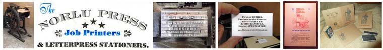
Cardstyle Top and Bottom
I was vaguely aware that some Stanley Mouse artwork in the 1960s had an almost Art Nouveau feel, but usually with a trippy distorted look to the letters like those designed by Wes Wilson. Rose Heichelbech wrote a nice piece about this unlikely marriage. In the era of Art Nouveau, Barnhart Brothers & Spindler cast a typeface in 1914 called Cardstyle for use in social announcements. I have two 12-point fonts of it and they are just quirky enough, with their tiny serifs, and distorted crossbars and arms to create a caps and small caps effect that is way more hip than Cardstyle’s ubiquitous cousin Copperplate Gothic. I set the top and bottom lines of the design in this face.

Laclede Provides the Curves
Gustav F. Schroeder designed a typeface called called Laclede for Central Type Foundry in 1897, as the Art Nouveau movement was nearing its zenith. Although there aren’t many (if any) surviving examples of this face being used in commercial artwork of the 1960s, its curvy appearance helps to create the desired look, as Laclede lacks almost any rigid features, much like the uninhibited letterforms used like display faces seventy years after this face’s first appearance. My collection includes fonts of Laclede in 24 and 36 points, and I used both in the coaster for Fayetteville Technical Community College’s library. You can’t have the 1960s without “Peace” and “Love” (set in 24 point) and “Library” in 36 point really pops, especially in the vibrant PMS 2635 from Southern Ink Company.

Resurgent Cooper Black
The last typeface I specified was Cooper Black. While choosing the previous two faces was more or less a discovery process, I knew as soon as this project came into the shop that I would find a way to use Oswald Bruce Cooper’s namesake face. Barnhart Brothers & Spindler (BB&S) introduced this typeface in 1922 and it became American Type Founders’ ATF 1592 when the huge foundry acquired BB&S. I remembered reading last year that it enjoyed a revival in the 1960s, and agreed with the observation that Cooper Black gives off a distinctive 1960s vibe, despite its origins fifty years earlier. The 14-point font that I selected to set “60th BIRTHDAY OPEN HOUSE” is a Montotype font that came from Charleston, South Carolina’s Quin Press through my friend Kim Hill. The Cooper Black comeback never really ended, as Pedro selected it for the typeface on his famous t-shirt in Napoleon Dynamite (2004) and the titles of the 2023 reboot of The Wonder Years television show feature a stylized version of it.

Sock it to Me and Lay that Ink Down
The Paul H. Thompson Library Open House coaster project also gave me the opportunity to squeeze some lesser used Southern Ink Company inks out of their tubes and onto the ink disk of the 5×8 Kelsey that I acquired a few years ago. In addition to the previously mentioned PMS 2635 purple I used PMS 334 green and PMS 1375 orange. Midnite Black was a great choice for printing on the coaster blanks from Katz Americas.


