
The Dictionary.com definition of the adjective recherché is (1) sought out with care; (2) very rare, exotic, or choice; arcane; obscure; or (3) of studied refinement or elegance; precious; affected; pretentious.
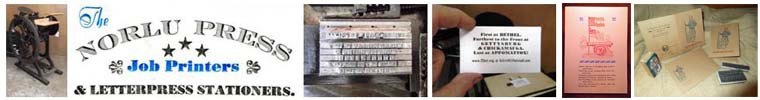
Any of these is appropriate to describe a font of simultaneously dignified and whimsical looking 18 point metal types that I acquired from a printing colleague I know in Pittsburgh, Pennsylvania. The font was one of several that he included in a transaction that allowed him more room for his passion for wood types and provided me with another option for re-envisioning printed works of the mid-1800s though the mid-1900s. This is the period that I see as the zenith of commercial letterpress printing.
Sought out with care
Oftentimes, when one acquires an antique, any clues that help to establish a provenance for the item have value in and of themselves. In the case of the types that are the subject of this blog, my friend had a plastic wire comb-bound specimen book of types that accompanied the purchase he made. The book belonged to a Pittsburgh area printer named Frank M. Hughes, who operated a hobby print shop named Primer Press. Each of its forty or so pages was an old-fashioned library card catalog-style presentation of a font in his collection. Clearly, this artifact was recherche, in that it must have been sought out with care and retained with these types.

Exotic
My friend was kind enough to give me Mr. Hughes’ book, and he pointed out that one of its pages corresponded to the font I had purchased. At the center of the slightly yellowed page, a very nice impression in black ink of numerous characters and figures from the font showed the types in their printed form. The scrolled embellishments of the upper case and some of the lower case characters were the immediate feature that connected this artifact to the font of types…exotic in a recherché way, for sure!

Studied and refined
The specimen did not include the entire alphabet, but when I examined the types, I was excited to see they were complete, including alternate characters for the lower case “h,” “m” and “n.” A delicate ascender of considerable height made the upper case “N” especially distinctive, as did equally impressive descenders on the upper case “M,” lower case “f” and ampersand (&.) These features contributed to a studied and refined set of letterforms.

Is it Pembroke?
At the top of the specimen book page, Mr. Hughes (or perhaps a previous owner of the font who printed the book) indicated that the font was named “Pembroke.” Added in pencil were the annotation of “MacKellar, Smiths & Jordan” and a little drawing of the distinctive triangle within a circle pinmark of this foundry. The only other information, also written in pencil, was the warning “DO NOT SELL COLLECTOR ITEM.” Clearly this font of Pembroke was more rare than the ubiquitous Copperplate Gothic or Cheltenham variants that one can find on Ebay. In my frequent reviews of Mac McGrew’s study of Twentieth Century metal types and numerous editions of American Typefounders catalogs , I did not recall seeing a font named Pembroke, nor did these characters appear especially familiar. Pembroke was rare, but how rare was it? Intensive study of these and other references, with the specimen page in hand, failed to produce a match. More than twenty Google searches of various Boolean strings failed to cajole the Internet into providing a font named Pembroke or an image that satisfied me as a match.
Go with what you know
One thing I knew for certain about this font was that the foundry of MacKellar, Smiths & Jordan (MS&J) cast it, as the pinmark appeared on every character. The Internet Archive provides dozens of invaluable publication digitizations of interest to letterpress printers, to include several editions of MS&J type catalogs. I scrolled through every page of the 1892 edition and scrutinized the beautiful specimens of types, until, on page 59, I came across the match. All of the distinguishing features were there and I was absolutely certain this was the font that was not to have been sold, but which I was thrilled to identify.
I also found Recherche as an MS&J offering in an even older 1888 edition of a Shniedewend & Lee catalog.

It was not named Pembroke, but rather and most appropriately, it is Recherche: sought out with care; very rare, exotic and choice; arcane, obscure and of studied refinement and elegance; and precious, affected, and pretentious.


Very interesting article. Thank you so much. Font resembles Canterbury in some ways.
LikeLiked by 1 person
Thanks for your comment. I agree that it is similar to Canterbury. The thin vertical strokes make it appear very close. I have Canterbury in 12, 14, 18 and 24 point.
LikeLike