A Printer’s Nod to the Germans

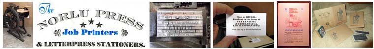
This post is part of my preparation for a first-time ever Norlu Press event that will take place later this year. More posts to follow as the big days get closer.

The form of letterpress printing that the west has known since the middle of the 15th Century began in Germany, when Johannes Gutenberg and his associates Peter Schoffer and Johann Fust combined movable types with an adaptation of wine and oil presses to reproduce information in printed form with speed and quality theretofore unknown. 

Mainz, Hesse (later Germany), 1455: Gutenberg, Faust and Schoeffer used moveable metal types and a wooden press to print about 180 copies of the Holy Bible.

As an aside, this historical novel about what happened in Mainz is a great read and one of my favorite books on the history of printing.

My dad composed and printed his first lines of metal type in 1937 and although he was not of German heritage, he lived a printer’s life, immersed in the legacy of the famous German Gutenberg. He passed his passion for printing on to me and thanks to my mother’s genes, I enjoy a special connection to the land of Gutenberg. Mom’s great grandparents came from the European states of Bavaria, Hesse-Darmstadt and Baden, which all became part of modern Germany. I am unaware if any of my German ancestors were printers, but as I apply what I learned from my dad (who was born in Italy), I often reflect on the legacy of German printing.

Dad was proud that an Italian named Giambattista Bodoni designed one of the most enduring and beloved typefaces, but many of the technological advances in letterpress printing owe their discovery to Germany, the ancestral homeland of my mother.

Italian master printer Giambattista Bodoni also designed typefaces in the late 1700s, one of which is named for him.

In addition to Guttenberg, Fust and Schoffer, one must consider the Linotype type casting machine patented by German-born inventor Ottmar Mergenthaler. He perfected the technology to cast lines of letters and words as single pieces of metal type.

The 1886 introduction of Ottmar Mergenthaler’s typecasting machine (perfected four years later) contributed greatly to the escalation of the publishing industry.

Heidelberg printing presses made in Germany were known for their technical superiority and are central to what remains of the letterpress printing enterprise of the 21st Century.

The fully automatic and highly evolved Heidelberg Tiegel (Platen) printing press, known universally as the “Windmill,” was introduced in 1914 and produced with improvements until 1985.

Not all of the German contributions to printing were demonstrations of mechanical superiority. The innovative and minimalistic Bauhaus school of design (1919-1933) introduced modernism to architecture. Its melding of technology and art influenced design of furniture, automobiles and eventually graphic design and typography.

The title page of this Bauhaus book features early letterforms that inspired the Venus, Futura and Kabel typefaces.

After learning the basics of letterpress printing as a teenager, my father used his World War II GI Bill to attend the printing program at the Rochester Institute of Technology. After graduation, he worked initially as a pressman, tending the workhorse printing press of his day, the Miehle Vertical that American of German descent Robert Miehle designed.

Chicago’s Robert Miehle (1860-1932) perfected a previous design of a cylinder-based letterpress printing press that became a commercial printing workhorse in the latter part of the 20th Century.

I will share my progress as I invoke my German ancestry and prepare The Norlu Press for the upcoming engagement. In the meantime, here is a 19th Century lithograph from Nuremberg, Germany with a hint about what is coming up. Prost!

First Christmas Card for the 2015 Season

This holiday card features Stardream Citrine metallic paper, which is imported from the Cordenons mill in Italy (archival quality and acid/lignin-free). The silver paper, combined with PMS 357 green holly leaves and PMS 485 red berries printed from early 20th Century American Type Founders ornaments, produces a shimmery, festive look and feel. The message is timeless, set in Trafton Script foundry types and printed in classic black ink. Two additional ornaments, most likely from about 1900, complement the text and add to the traditional and classy look of these cards. Inside is blank and the back panel includes interesting information about the card and my print shop. Each order of five comes with five red foil-lined envelopes personalized with your name and address. All inks are soy-based from Southern Ink Company.

Shimmery holiday greeting card in three colors on Italian Cordenons Stardreeam Citrine metallic paper.

Shimmery holiday greeting card in three colors on Italian Cordenons Stardreeam Citrine metallic paper.

Detail of the early 20th Century ornaments cast in lead by American Type Founders and the classic Trafton Script font from the Bauer Type Foundry in Germany.

Detail of the early 20th Century ornaments cast in lead by American Type Founders and the classic Trafton Script font from the Bauer Type Foundry in Germany.

Letterpress holiday greeting card in three colors (PMS 485 red, PMS 357 green and dense black--all soy-based from Southern Ink Company) with complementary red foil-lined envelope.

Letterpress holiday greeting card in three colors (PMS 485 red, PMS 357 green and dense black–all soy-based from Southern Ink Company) with complementary red foil-lined envelope.

Descriptive panel on back of 2015 holiday greeting card from The Norlu Press.

Descriptive panel on back of 2015 holiday greeting card from The Norlu Press.

They are available on my Etsy shop at https://www.etsy.com/your/shops/TheNorluPress/tools/listings/250582342