This is the first of three albums that emerged from The Norlu Press in the summer of 2016 as an entry in the juried exhibition, “The Art of the Album Design and Printing Competition” during the 2016 Los Angeles Printers Fair at the International Museum of Printing in Carson, California.

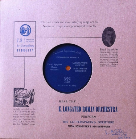
My original sketch of the E. Longated Roman Orchestra album cover with an image of a 1920s record jacket.
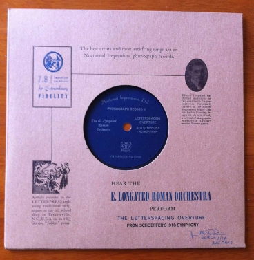
Given the requirement to create a fictitious band named after an historic typeface and to design and print in letterpress and/or screen printing an album cover for the band, I set out to create something unexpected. As is often the case, I looked to history for inspiration. The design of 78 RPM phonograph record jackets printed in the 1920s seemed to be something that others may ignore, so I chose some of these very early phonograph record sleeves as a starting point. For my stock, I acquired blank 78 RPM record jackets (10 3/8” x 10 3/8”) that were already die-cut, folded and glued in Kraft Brown paper that was not unlike the brown paper sleeves of the era I wanted to evoke and began setting the types that I would use to print the album covers.
Although it was not a requirement, I decided early in the process that I would incorporate the actual font that I had chosen for the recording artist’s name.

- Detail of the Stephenson Blake (SB) 36-point casting of the Elongated Roman font, with a foundry-cast 12/36-point quad bearing the S&B manufacturer’s mark.
For the E. Longated Roman Orchestra, I used an attractive 36-point Stephenson Blake (SB) Letter Foundry casting of Elongated Roman. The Sheffield, England-based foundry sold this font to American printers as premium lead foundry types through arrangements with various merchants, and it appears in the 1967 American Woodtype Catalog. Other typography in the design includes Caslon for body text, a well-worn circa 1900 Combination Gothic and ATF Outline Gothic and Stradivarius for display.
The design includes three graphic elements beyond the typography. Along the right side of the album cover I placed an early 20th Century oval-shaped copper photoengraving of a dapper-looking gentleman whom I named Edward, or “E.” Longated, the leader of the celebrated and quite fictitious orchestra that bears his name. Body text below the portrait tells Longated’s story, which is actually a discussion of the Elongated Roman font.
- Hand composition of an antique metal cut with Outline Gothic, Century Catalog, Stradivarius and Elongated Roman fonts.
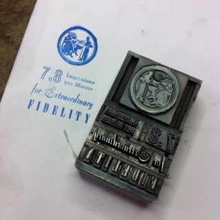
Opposite this, on the left side within a mitered rule box, is a circular lead cut of a man operating a platen-style printing press that is not unlike the circa 1863 Gordon Jobber I used to print these album covers. Display typography describes this phonograph as “7.8 Impressions per Minute for Extraordinary Fidelity.” This is the first of four plays on printing and record album terms I included in the design. While these albums were played at 78 RPM (rotations per minute), I changed up that idea by adding a decimal point between the two numerals and changing the description to the approximate number of impressions a printer can achieve on a hand-fed platen-style printing press. A magnesium-on-wood cut of a classical music performance appears at the bottom left of the design, with body text re-imagining the recording of phonograph as a letterpress printing process.

- Detail of the album cover showing the recording artist and title (Caslon, Elongated Roman and Combination Gothic metal types.)
At the bottom right of the design, the name of the recording artist appears, printed in VanSon oil-based process blue ink, mixed with opaque white, to produce the “gas-blue” color that became popular at the end of the 1920s, as gas-powered stoves were gaining popularity in America. The text states that the E. Longated Roman Orchestra is performing “The Letterspacing Overture” from Schoeffer’s .918 Symphony. Peter Schoeffer worked under the direction of Johann Gutenberg, as Alix Christie wrote in her historical novel, Gutenberg’s Apprentice (Harper, 2014). The .918 Symphony reflects the requirement that American types be a standard .918 inches in height (type-high) and “The Letterspacing Overture” is, in fact, set in Combination Gothic with exaggerated letter spacing.

- Printing one of the black forms on the circa 1863 Gordon Jobber press.
I printed these album covers on a relatively small platen-style printing press, the platen surface of which measures just 7” x 11. Positioning of the paper on the platen surface and the physical limitations of the press’ early industrial age workings limit the area that is available for a printed image to less than half of the platen size, which required me to work in four 3.5” x 9” bands of image areas on the jacket. Within those areas, each color of ink required multiple steps to position and transfer the images. The print, therefore, is the result of seven complete iterations of the centuries-old letterpress composition/imposition/makeready/printing process.
Once I had printed the ten album covers that the competition required for submission, which I believe must have amounted to 175 impressions, I decided they required a record with printed label to achieve the effect I was seeking. My friend Tonja Scott at Tonja’s Lil Shop kindly die-cut from black card stock a quantity of 10.25″-records with a spindle hole in the middle. To these, I affixed a 3.75″ label die-cut from blue 120lb Classic Crest Patriot Blue Linen stock that nearly matched the gas blue text of the album cover.

- Printing the labels in metallic silver ink.
Prior to gluing the labels to the records, I printed them in metallic silver ink with text set in Canterbury (alternate caps), American Caslon Italic (alternate caps), Steelplate Gothic and Caslon metal types and a 1930s publishing ornament. The “Co” ligature of Steelplate Gothic in “Phonographic Record Co.” is appropriate for the era.
The last task was to print the back of the album cover. This was not a requirement for the competition, but I was having so much fun that I didn’t want to stop! I have had, for many years, a beautiful antique copper engraving of a pressman at his work that my dad, who taught me letterpress printing, acquired when he was just beginning to learn the trade in the late 1930s. As such, it most likely came from one of the many printing houses that existed in the early 20th Century in Rochester, New York. I had never proofed the image, but from a very young age, I can remember it being in the original Norlu Press that my dad established in Fairport, New York and I chose to include it as a manufacturer’s logo on the back of the jacket. While it does not connect directly to the content or theme of the front, I used some “artistic” license and added the phrase “a clean sheet every time” to associate it with text that appears on the front of the album cover.
- Detail from an early 20th Century copper engraving from the collection of Lewis “Hobie” DiRisio.
Some additional photos of the project are included below.